Most Android launchers are small variations on the same concept: One or more screens of widgets and icons (sometimes grouped) which can be used to start various different apps. It’s usually up to the user to place these icons on the screen, much like we’ve been doing for ages on our computer desktops.
If you too are in the mood for a more innovative take on the launcher, you could do much worse than installing Nokia’s (yes, they live!) free Z Launcher app.
It looks and works like this:
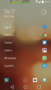
On the left is the default start screen. It shows a list of the apps I’ve most recently started, with the most used ones at the top (you can see that I was quite busy using Signal at that point).
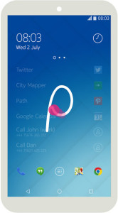
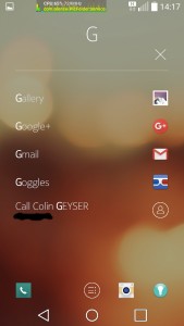
If you would like to start some other app which is not on the current short list, or view or call a contact, simply scribble the first letter of the app or contact on the screen! In my case, I scribbled a “g” (the “p” screenshot is from the Z Launcher play store page, because I was not able to screenshot it on my own phone), at which point it listed apps and contacts with the letter “g”. Again all of the “g” apps are listed in order of how much I’d interacted with them at that point.
Swiping to the right gives you a traditional widget area (here I have a weather (yr.no is the best, even here in South Africa) and a calendar widget), and swiping to the right gives you a traditional searchable list of all of your apps.
Z Launcher continuously learns about the apps and other items you interact with the most, and will always show you the ones that you interact with the most at the top. Over the past week of testing, this has saved me a significant amount of time finding and starting the phone functions I was looking for.
For saving me time, and doing it in an aesthetically pleasing way: 5 stars for you Z Launcher!


